Case Study · Tata Play · Mascot Integration
Coco, with purpose
When Tata Play introduced Coco, the goal wasn't simply to launch a mascot. The goal was much bigger — make Coco a meaningful part of the product experience. Not a sticker. Not a campaign. Not a one-time promotion.
Surfaces: Homepage · Pull to refresh · Success states · NPS · Onboarding
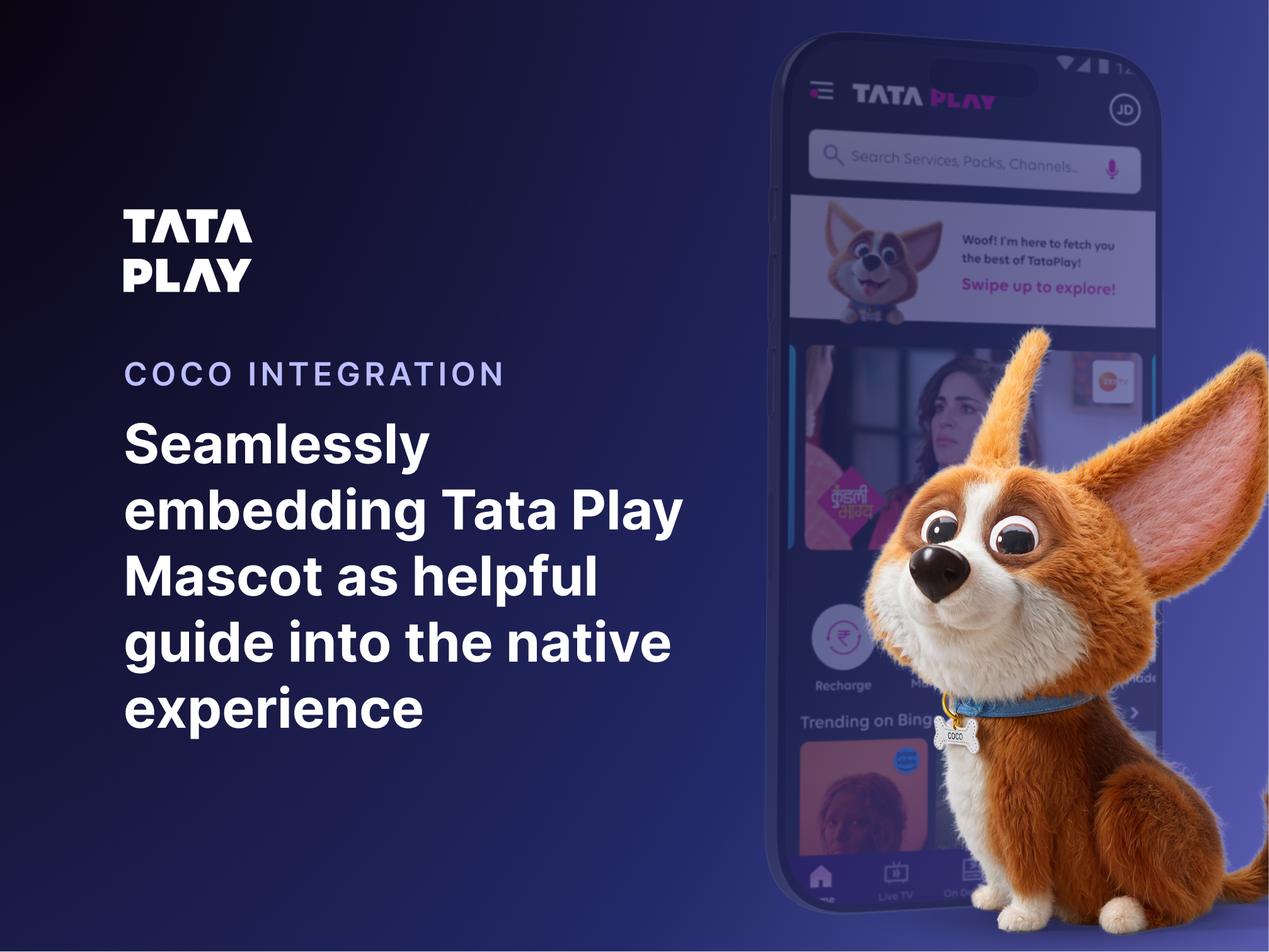
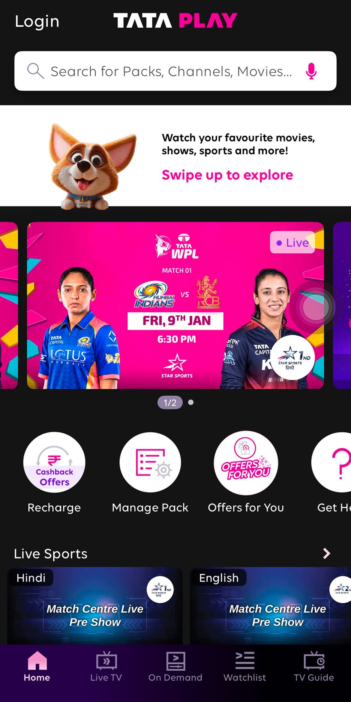
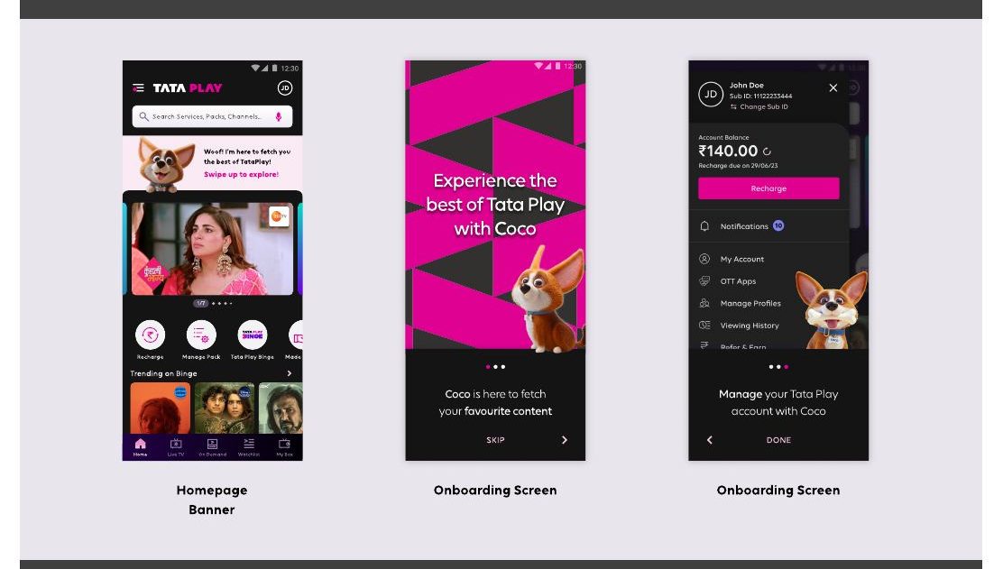
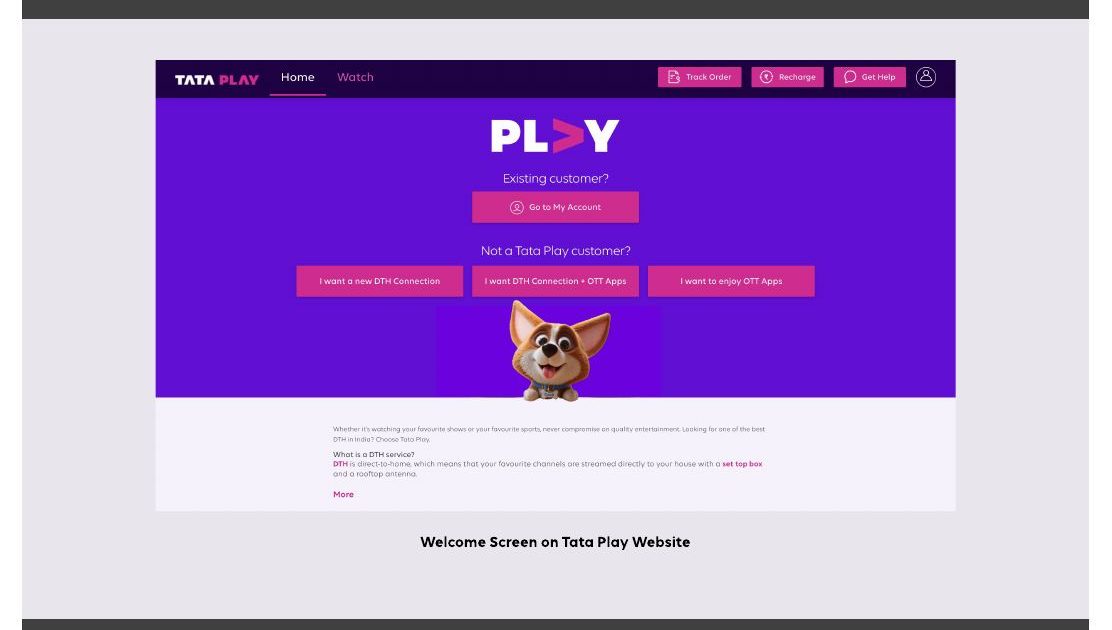
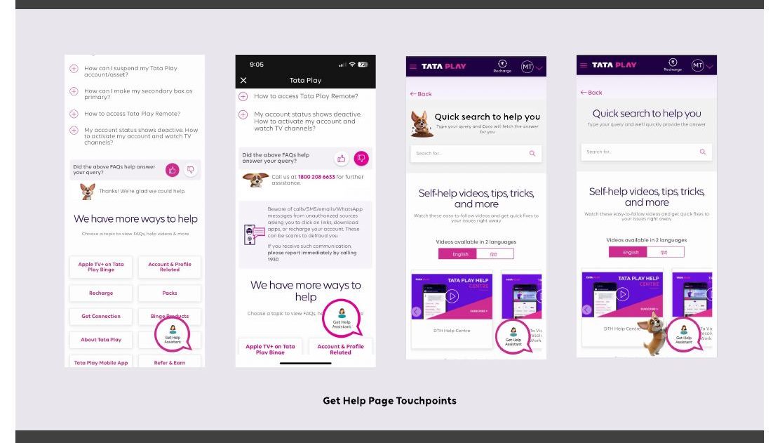
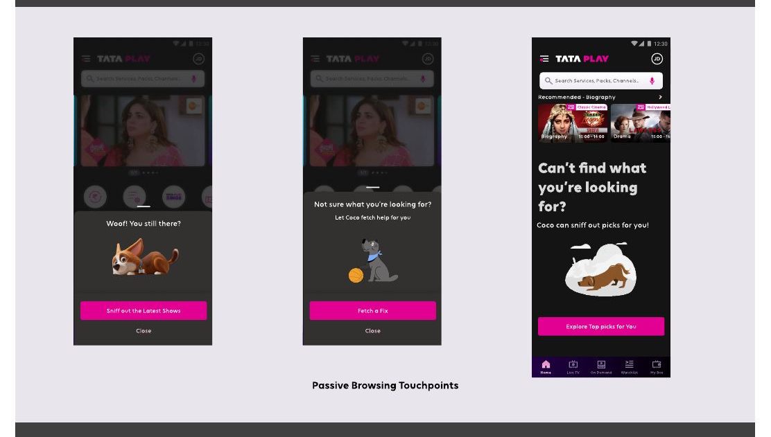
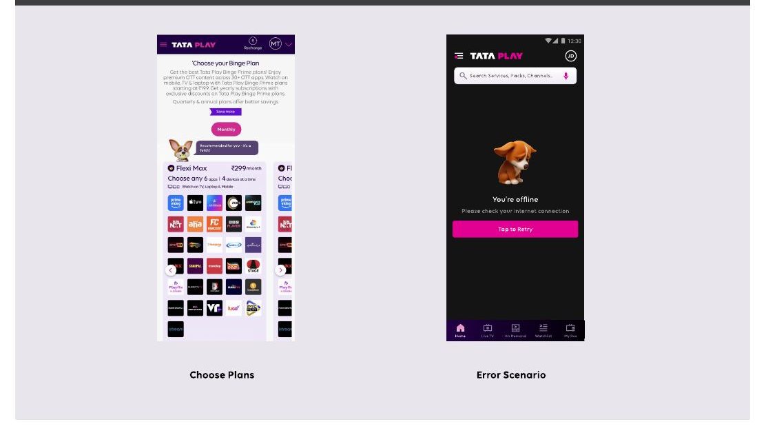
Homepage
Coco as a welcome presence on the main surface
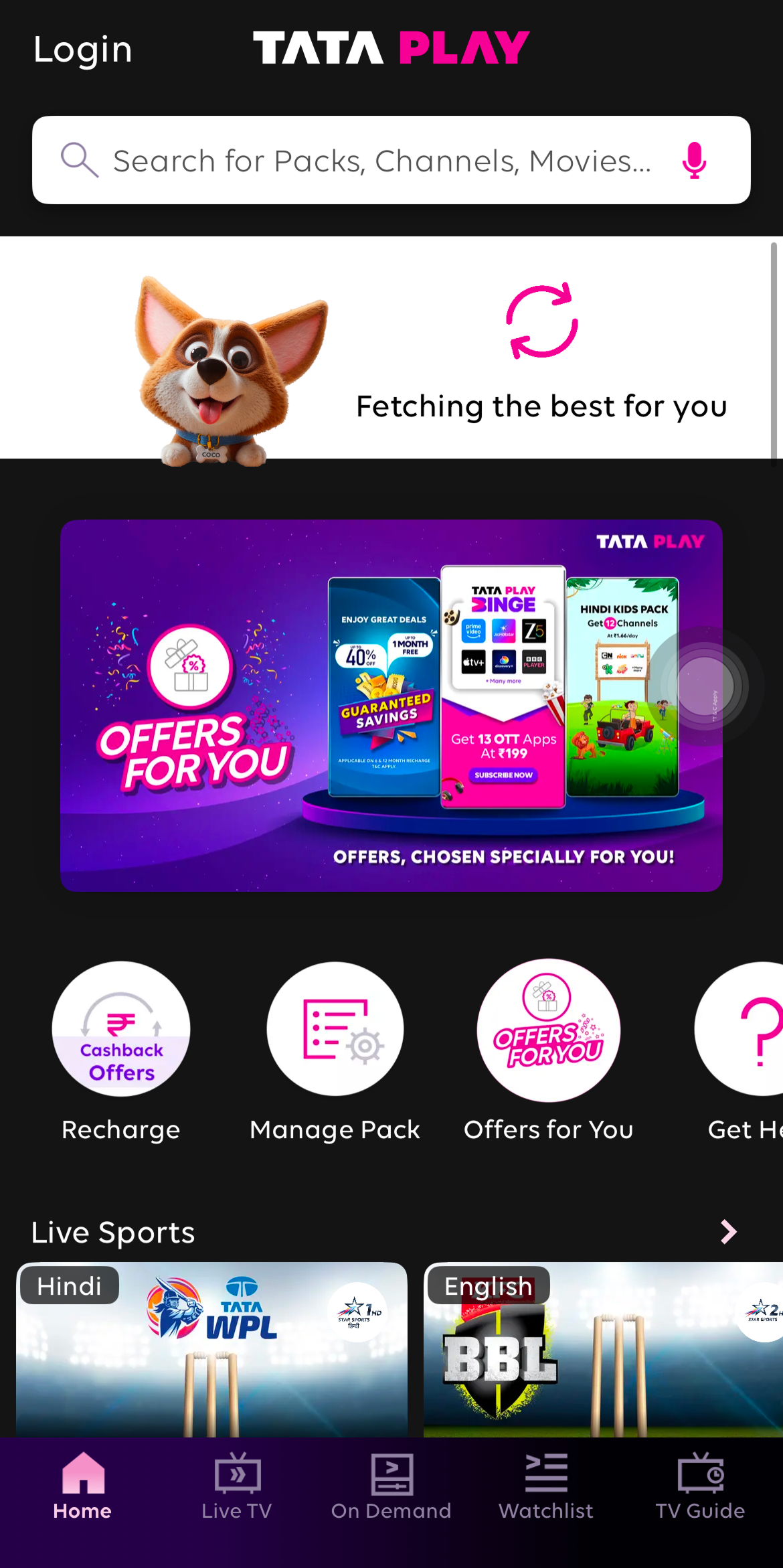
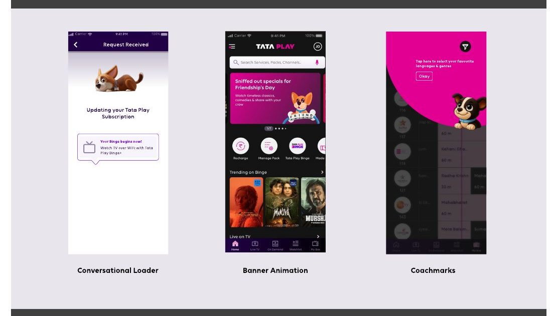
Refresh
Motion + delight on a habitual gesture

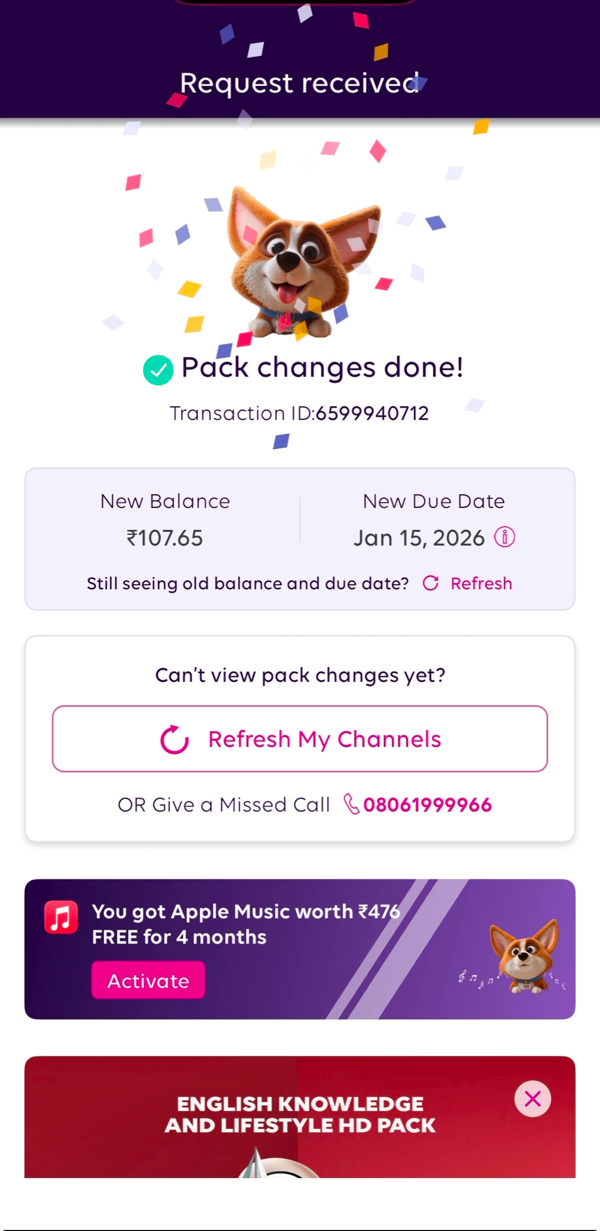
Success
Coco celebrating with the user
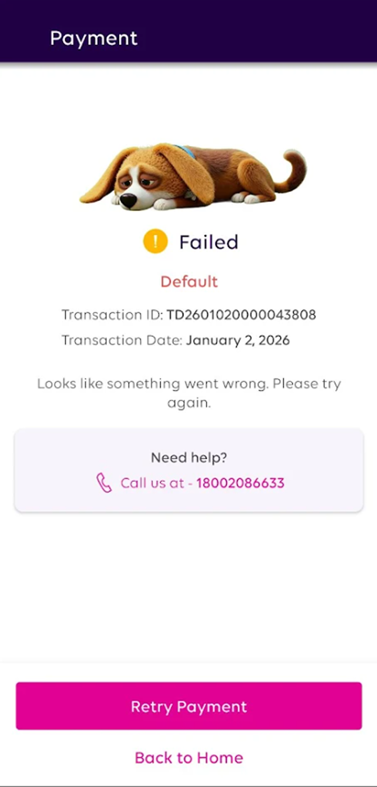
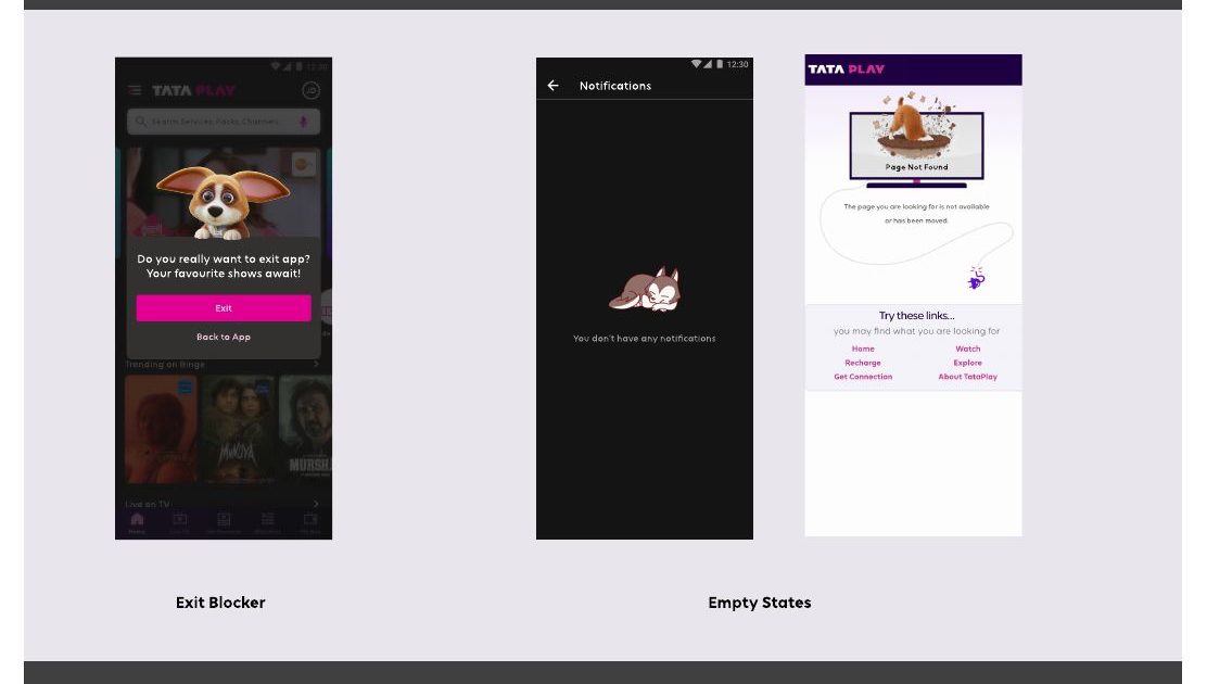
Failure
Coco showing up with empathy when things break
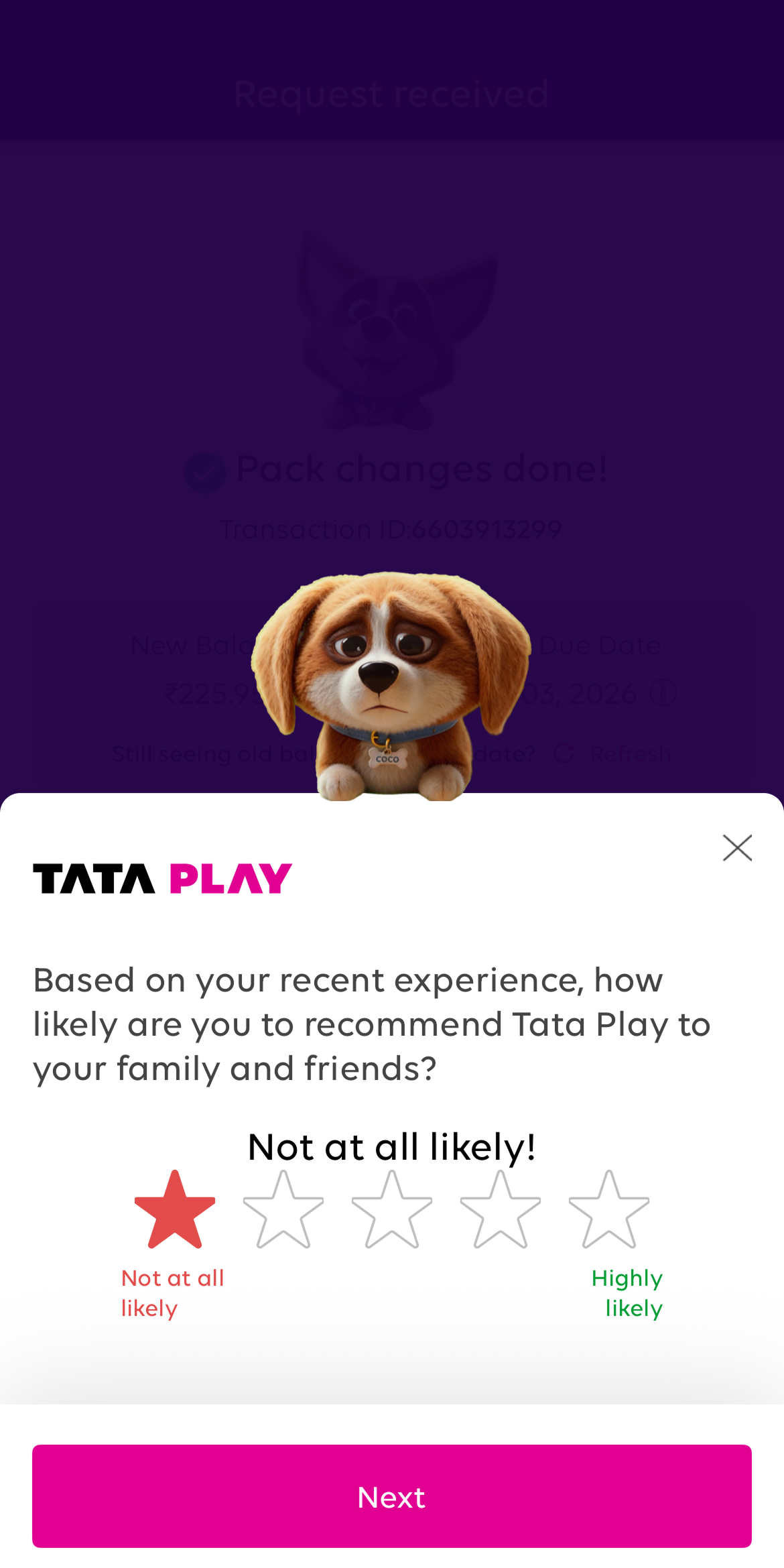
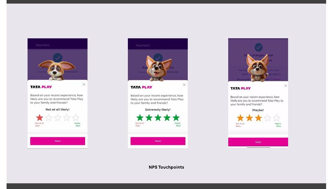
NPS
Coco encouraging feedback
01 — The challenge
Not "where can we show Coco?"
A mascot can easily become visual noise. The question wasn't where Coco could appear. It was where Coco could actually help.
- 01
Question 01
Where should Coco appear?
- 02
Question 02
What should Coco do?
- 03
Question 03
When should Coco stay invisible?
“Visibility alone doesn't create engagement. Relevance does.”
Three questions. The third one — when to stay invisible — turned out to be the hardest to answer, and the most important.
02 — Mapping the ecosystem
Before creating anything, I mapped everything.
Every major user journey across TPMA, the website, and Litmus. The goal wasn't to find places to put Coco — it was to find moments where Coco could genuinely do something: celebrate, guide, encourage, or support.
Amplify moments that feel like wins — for the user and the product.
→ Recharge success · Subscription confirmed · First login

35+
opportunities identified across all journeys
3
platforms: TPMA, Website, Litmus
4
distinct roles Coco could play
03 — The harder decision
Not every touchpoint deserved Coco.
One of the biggest decisions was deciding where not to use the mascot. Some journeys benefited from emotion. Others benefited from clarity. Mixing them up would weaken both.
- emotionSuccess states — celebrate wins
- warmthNPS — encourage feedback
- presenceEmpty states — need warmth
- guideOnboarding — first impressions
- focusHigh-stakes transactional flows
- clarityInformation-heavy journeys
- densityCluttered or complex surfaces
- trustError states needing precision
Adding Coco everywhere would weaken its impact. The framework was as much about restraint as it was about placement.
04 — Defining Coco's personality
Before designing screens, I designed behaviours.
Once the touchpoints were identified, a new challenge emerged: a mascot shouldn't behave the same way everywhere. Coco celebrating a recharge success is a different energy to Coco helping someone through an empty state.
So instead of jumping to screens, I first mapped how Coco should respond — given the context, and given how the user was likely feeling in that moment.
Behaviours were defined before a single screen was drawn
05 — Exploring possibilities fast
140+ explorations — before a single production asset existed.
The project moved quickly. Production assets didn't exist yet, but stakeholders needed something tangible to react to. So instead of waiting, I created rapid concept explorations — expressions, poses, scenarios, placements — to make the strategy visible and testable.
140+ explorations created before production. The goal wasn't polished output — it was giving teams something concrete to point at, argue about, and align around.
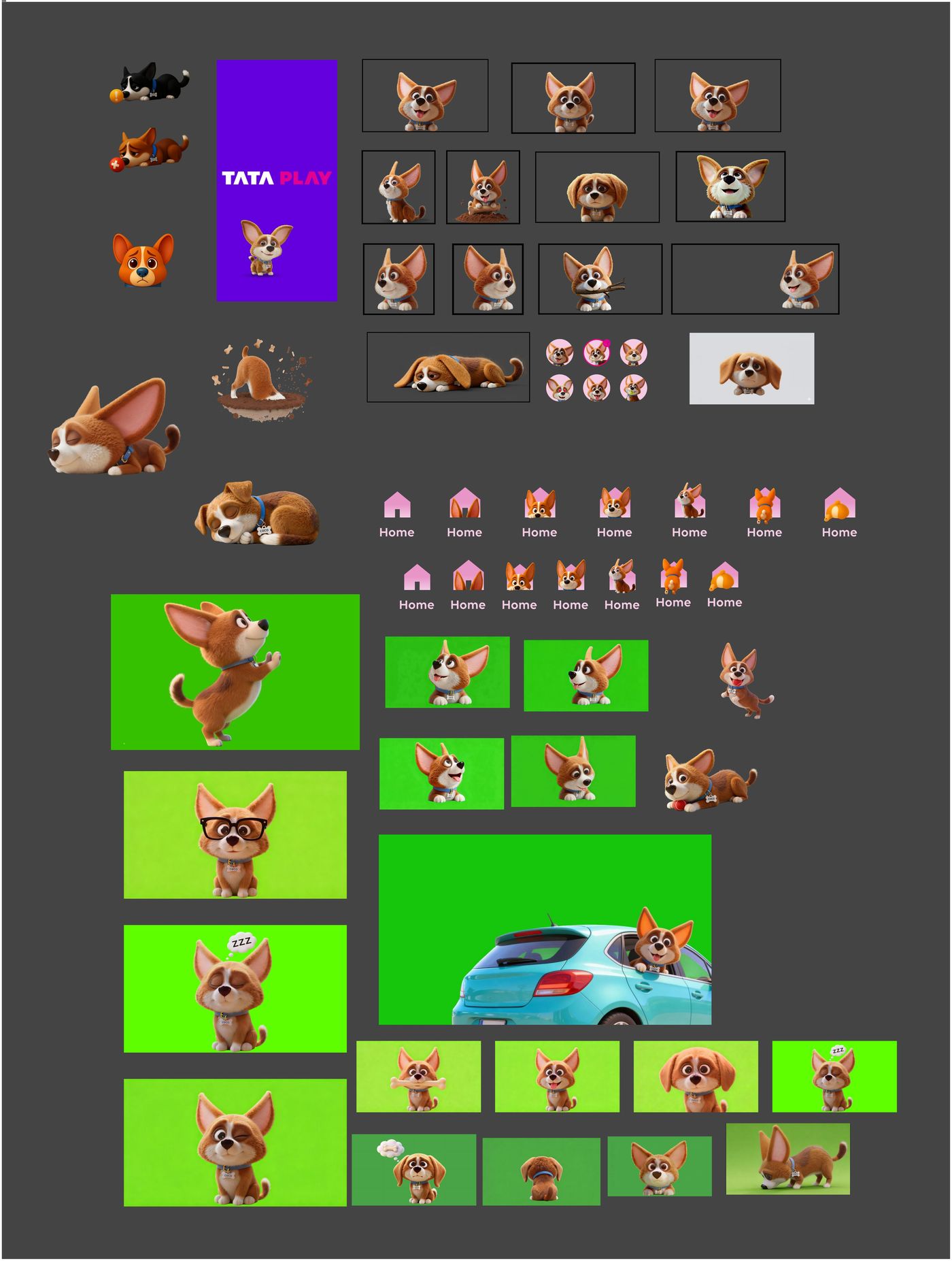
Scroll inside the wall to explore expressions, poses, scenarios and placements
06 — Aligning multiple teams
The challenge became less about design. More about coordination.
As the project expanded, five different teams got involved — each with their own goals and constraints. Brand cared about consistency. Product cared about experience. Tech cared about implementation complexity. Agency needed direction. Litmus needed specs.
The role shifted: creating one integration strategy everyone could align behind, not just handing off a screen.
Brand consistency
Product experience
Tech complexity
Integration strategy
Design Lead
Agency direction
Litmus specs
QA sign-off
Everyone had different goals. The hardest design decision wasn't about Coco's expression — it was getting five teams to agree on the same question.
Should Coco move?
Motion increased delight. But it also increased implementation complexity. The answer couldn't be "always" or "never" — it needed to be a framework.
- → Pull to refresh — the animation is the moment
- → Success states — motion amplifies the emotion
- → Onboarding — show, don’t tell
- → NPS prompts — the ask needs focus
- → Website headers — performance first
- → Cluttered surfaces — reduce cognitive load
Motion showcase — planned for Phase 2 rollout. GIFs and micro-interactions for pull-to-refresh and success states are part of the next release wave, once the static framework has stabilised across surfaces.
From strategy to production.
Concepts became screens. Screens became builds. The framework held across six surfaces.
Homepage
Banner · celebrate
Refresh
Motion · delight
Success state
Celebrate · emotion
NPS
Encourage · static
Website
Hero · guide
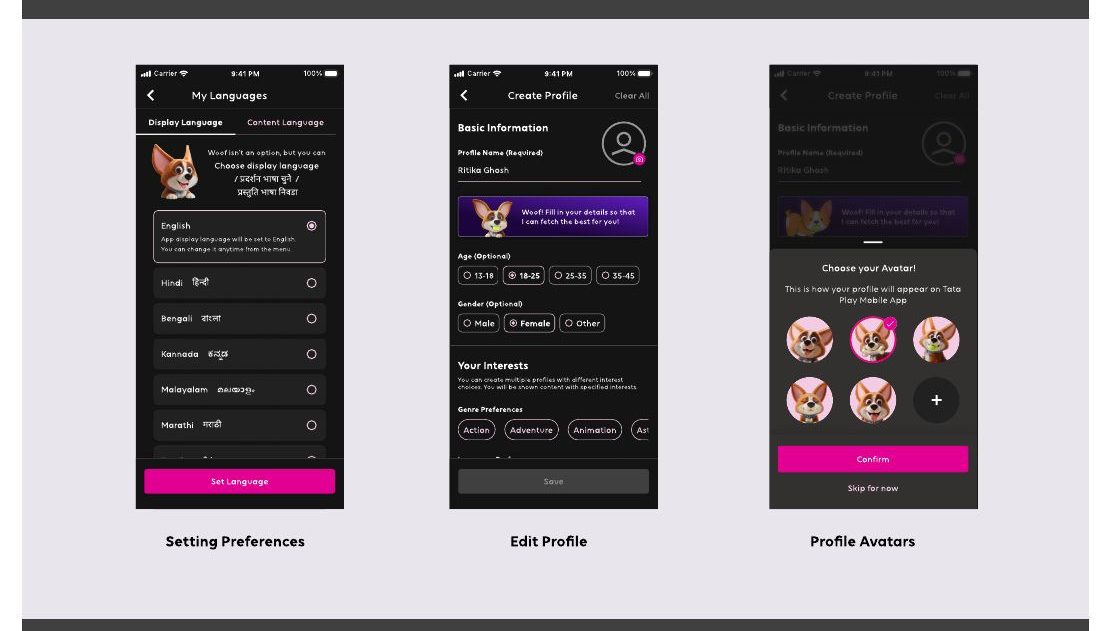
Onboarding
Guide · first-run
Ensuring consistency at scale.
With five teams implementing Coco simultaneously across three platforms, quality couldn't be left to chance.
70+
issues identified across platforms before sign-off
3
full review cycles across TPMA, website, and Litmus
07 — Impact
What started as a mascot initiative became a product-wide integration.
49 lakh impressions across five surfaces. Three awards. But the number that mattered most was harder to count: five teams, aligned behind one question.
49L+
impressions across all platforms
70+
QA issues caught before launch
5
teams under one strategy
Recognition
SPOT Award
Job Well Done
Star Performer
The reframe
This was a branding project.
↓
“In reality, it became a systems-design challenge.”
01
Mascots work best when they serve a purpose — not just fill a surface.
02
Consistency requires systems, not assets. A single illustration without a framework fragments.
03
Ecosystem thinking beats screen thinking. Map journeys before designing moments.
04
Alignment can be harder than design. Creating the shared framework was the real work.
“The hardest part wasn't designing the mascot. It was creating a framework that helped multiple teams answer one question: where does Coco genuinely improve the experience?”